
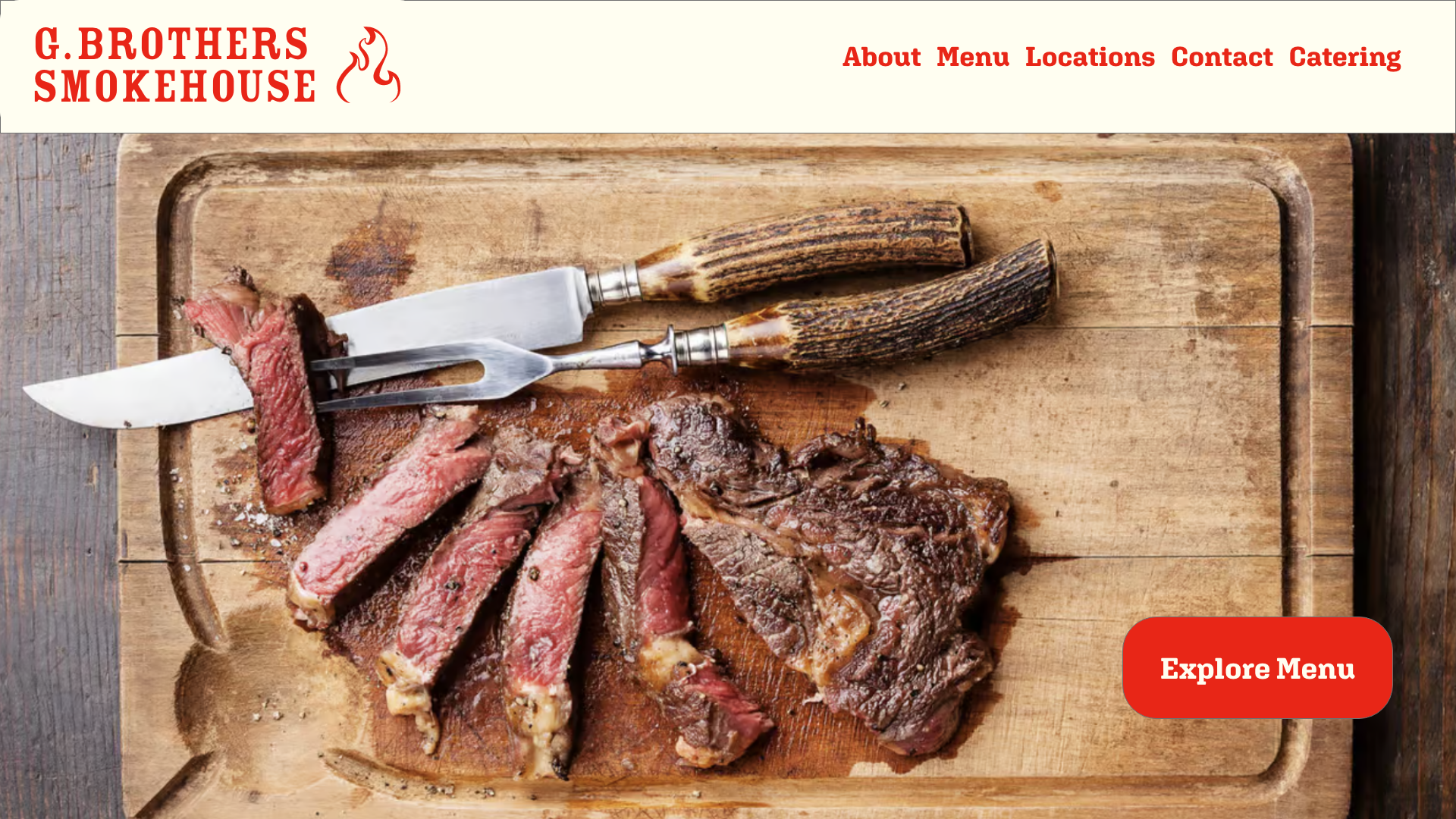
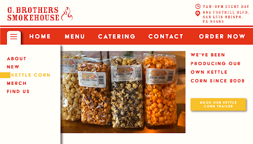
New Homepage — Desktop
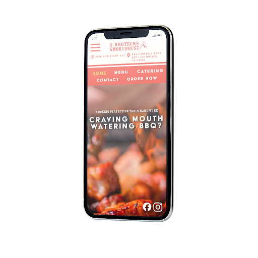
New Homepage — Mobile
Redesigned Pages
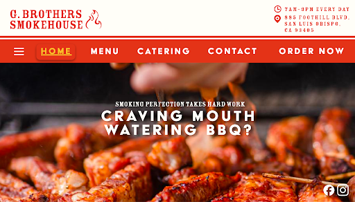
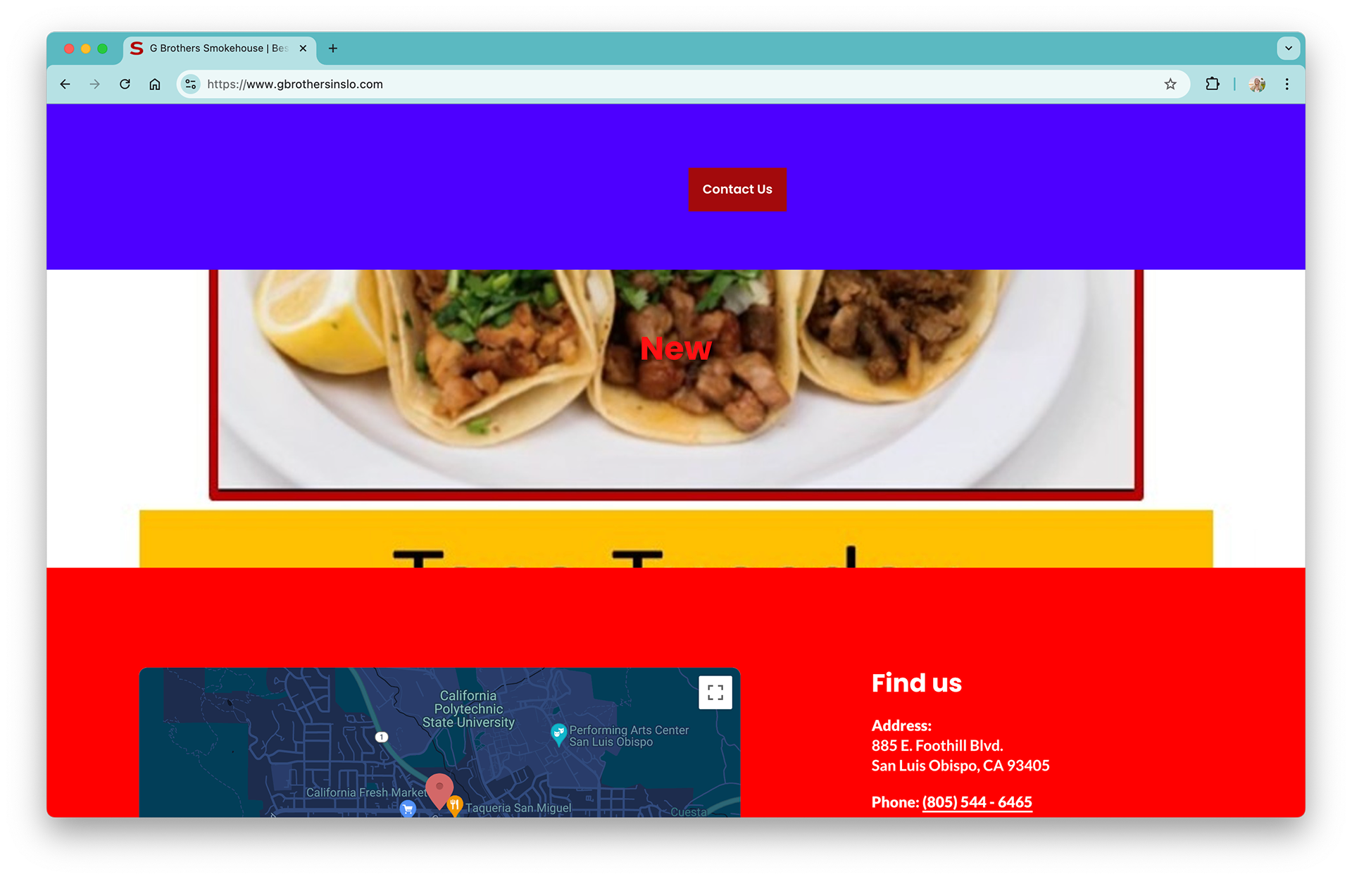
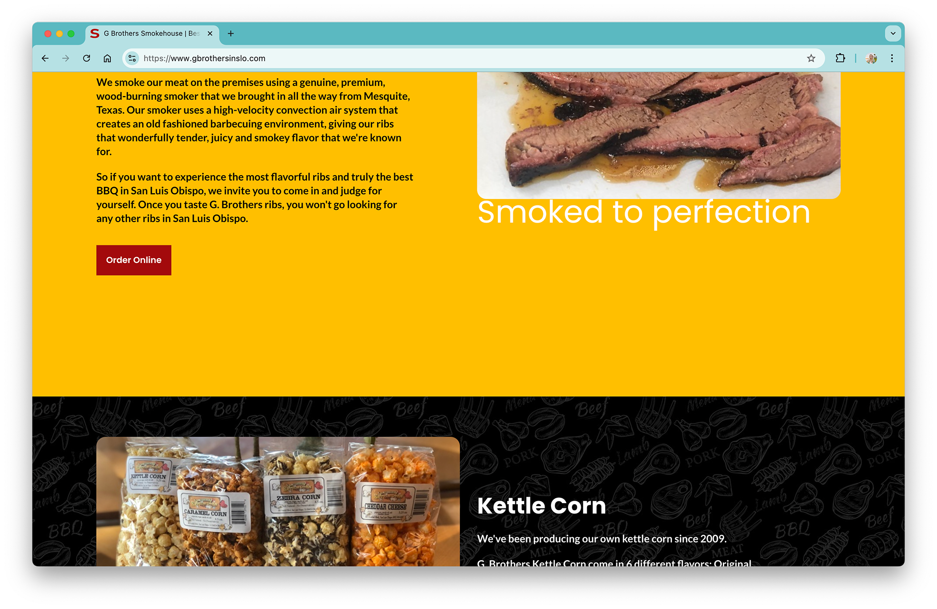
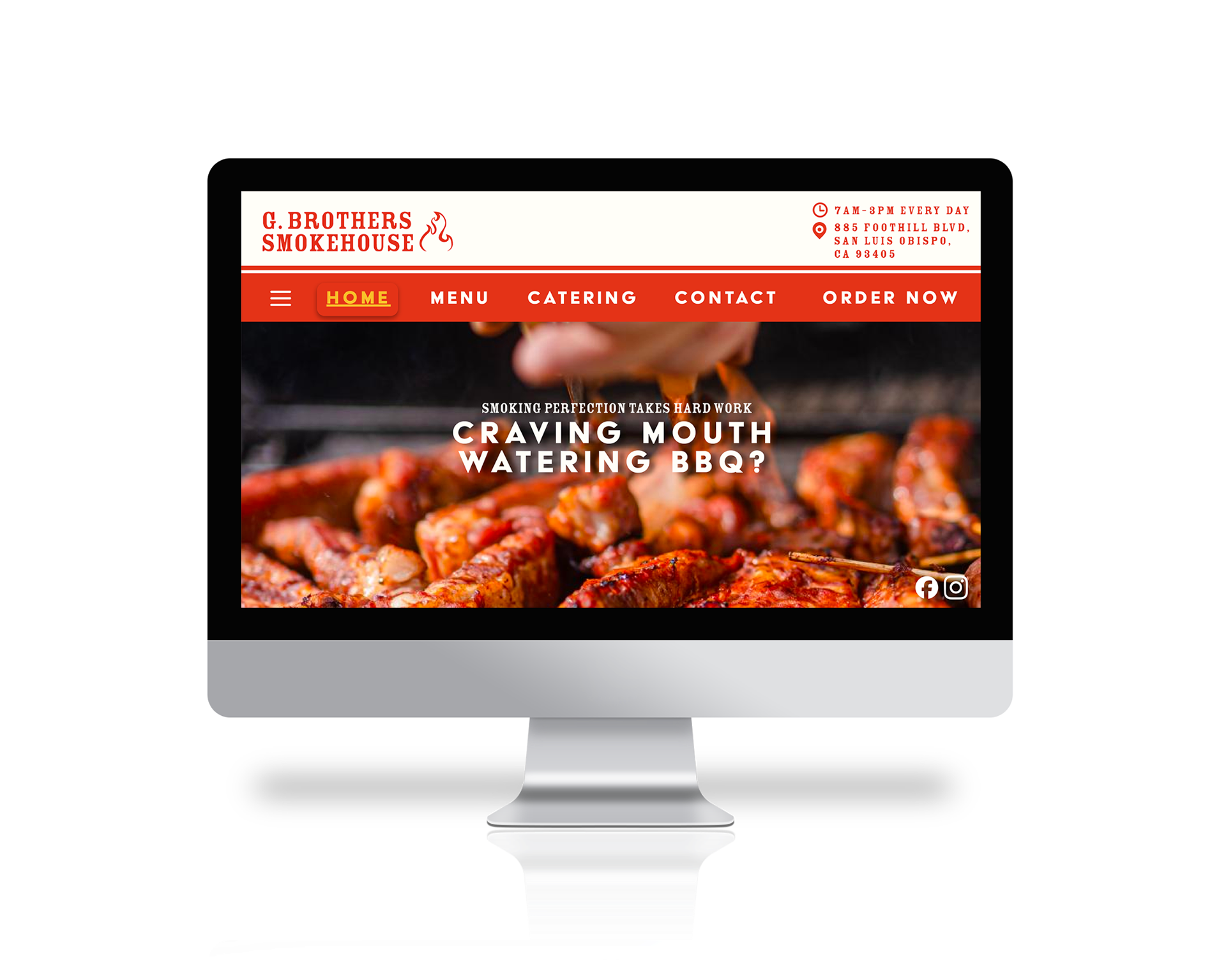
Home
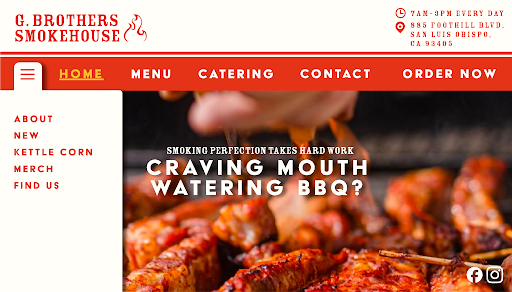
Home w/ Dropdown Nav
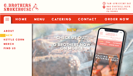
Hover: New

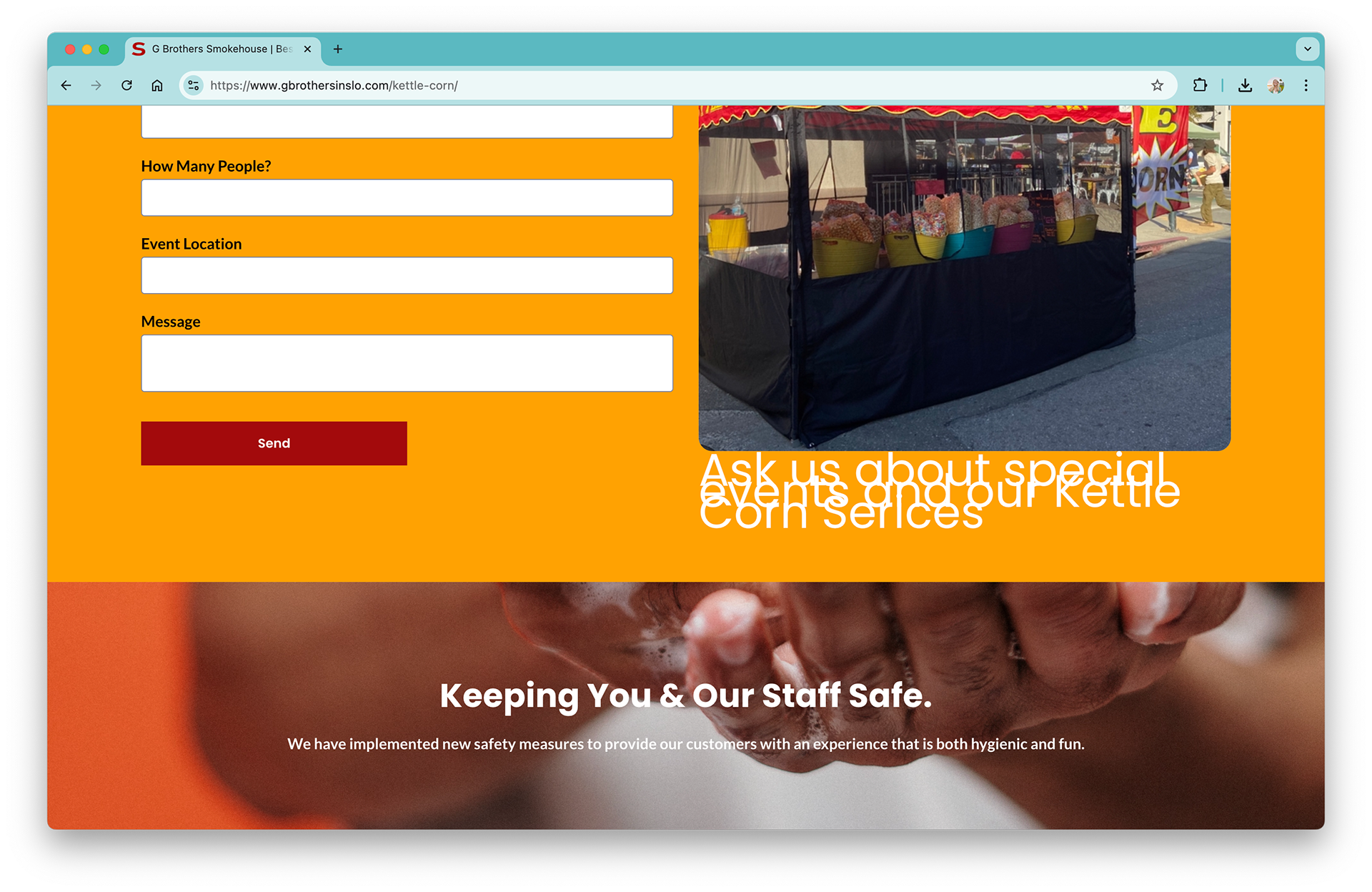
Hover: Kettle Corn

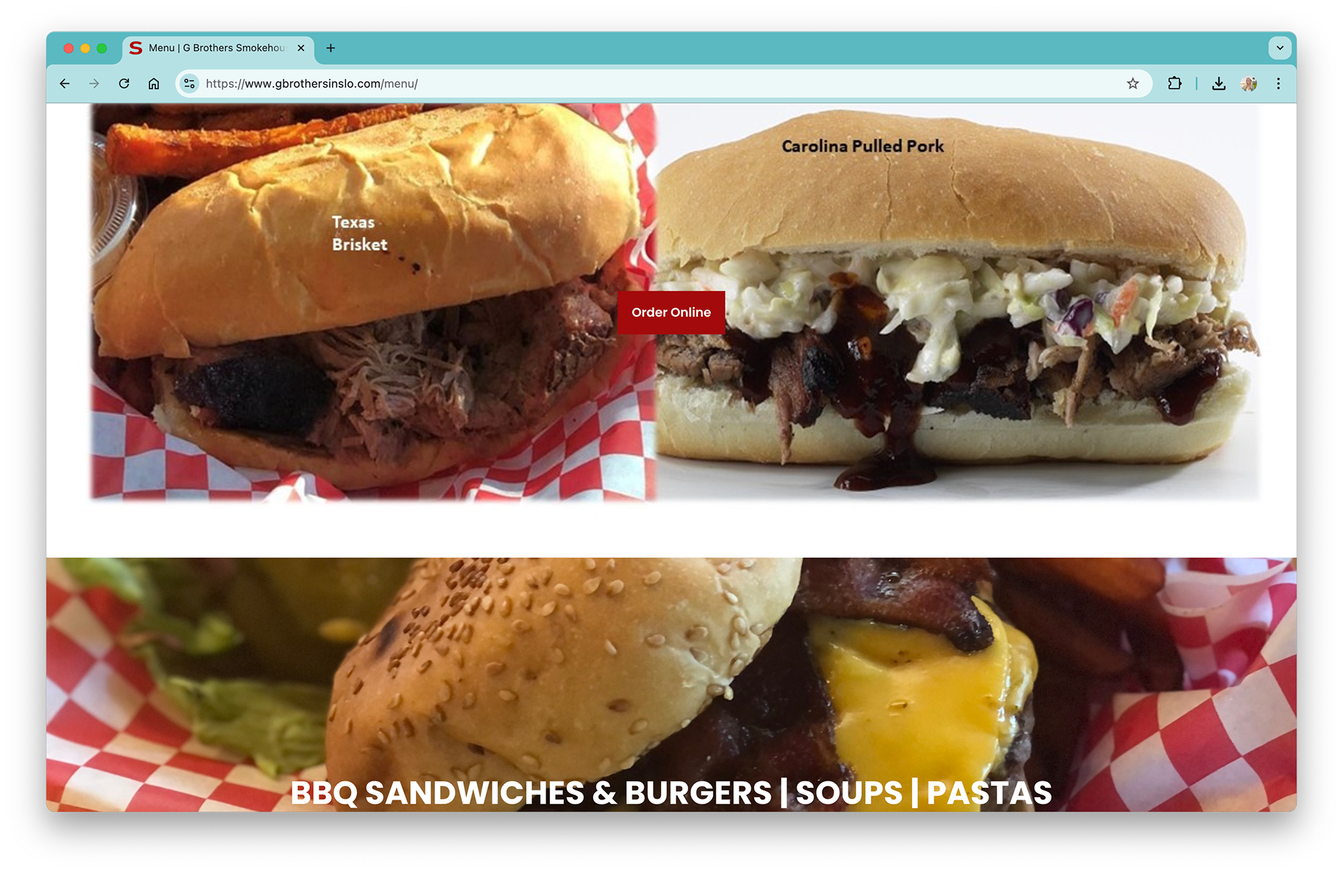
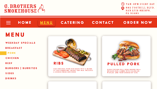
Menu

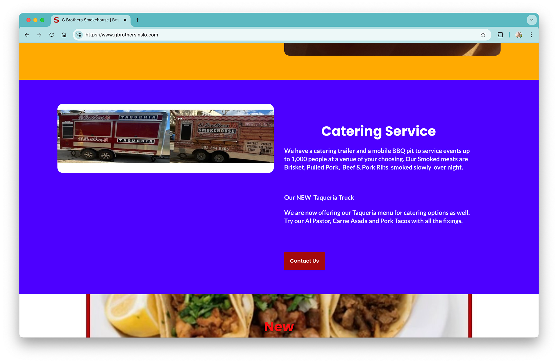
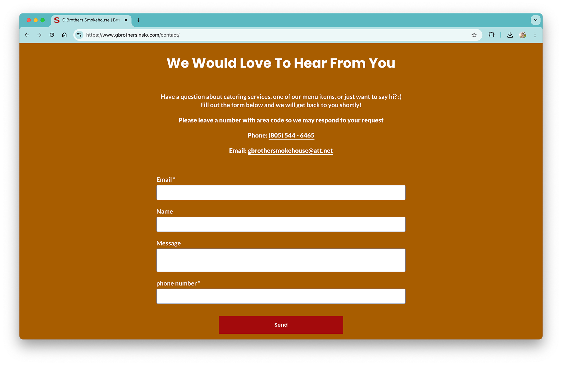
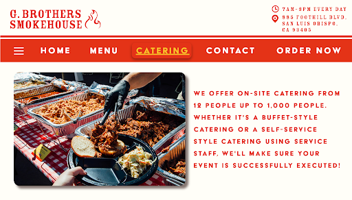
Catering
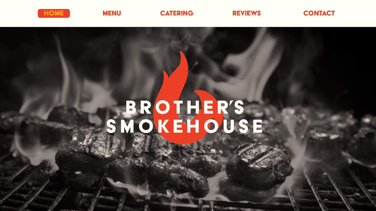
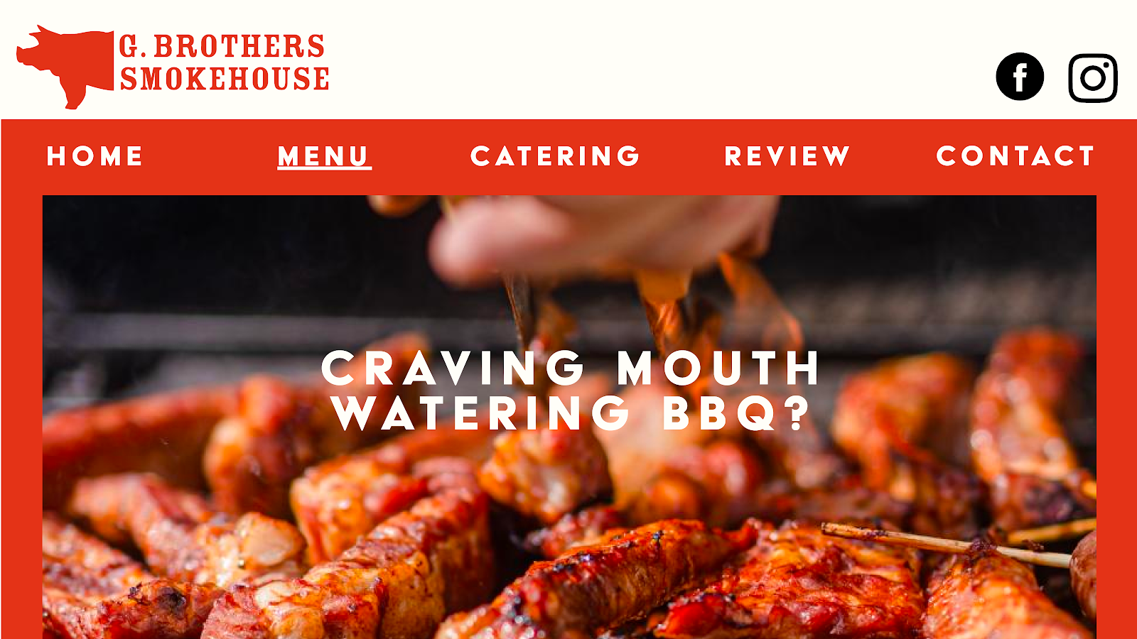
Current State
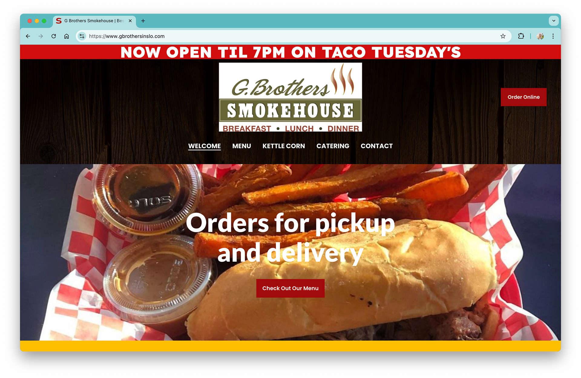

Issues
- Non-transparent logo.
- Low-resolution, unappealing food images.
- Inconsistent branding and lack of style guide.
- Heinous alignment crimes.
- Lacking a clear grid system.
- Missing elements impacting navigation and usability.
- Poor readability due to line height (overlapping lines of text), typography issues, and harsh colors.
- An inaccessible user experience misaligned with customer expectations.
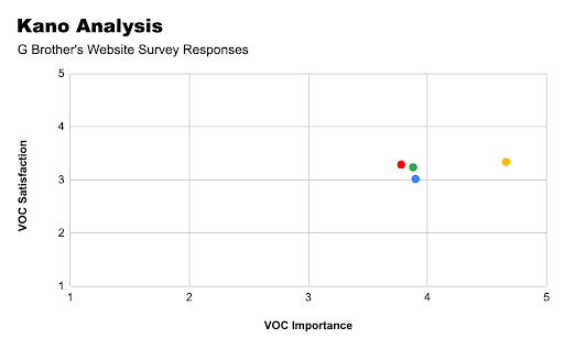
Users indicated that the most desired change was improved functionality, which surpassed visual appeal, brand consistency, and logo design. Only 12% of users reported satisfaction with the site's functionality.
Legend
visual appeal
functionality
brand consistency
logo design
visual appeal
functionality
brand consistency
logo design
We employed a Why-Why diagram to uncover the root causes of the smokehouse’s problems and visited the food truck to gather firsthand insights. These findings guided our design process, clarifying which rebrand elements to prioritize.
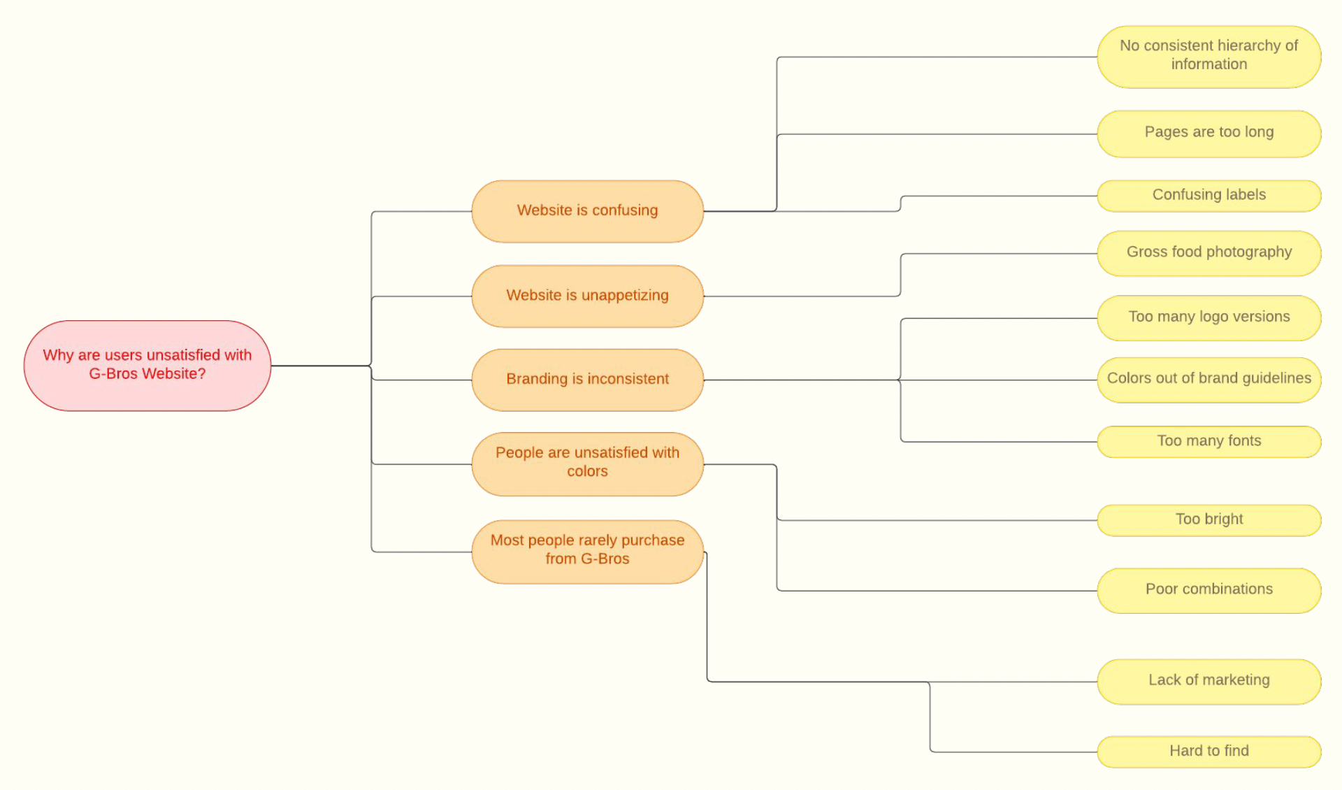
Why-Why Diagram
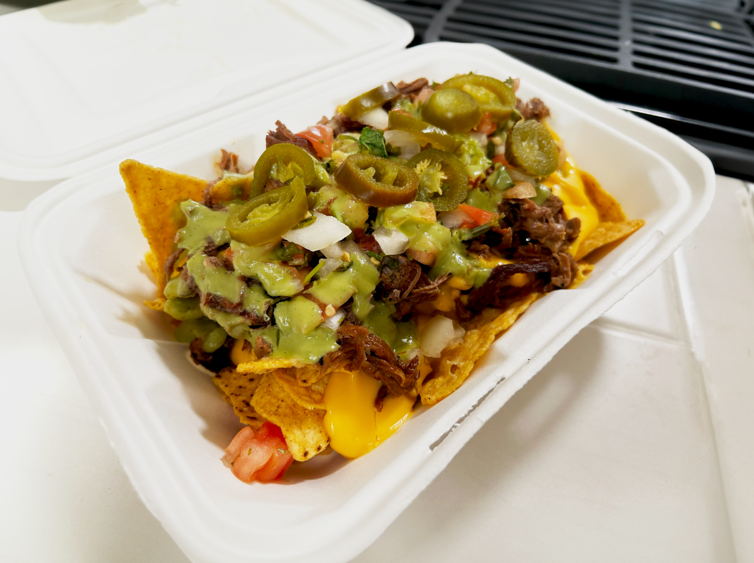
While the in-person food presentation was strong, inconsistent branding and design elements—like tacky, oversized vinyl—detracted from the user experience and failed to convey the quality of the product.

Design Explorations
Homepage Version 1
Homepage Version 2
Homepage Version 3
Logo Iteration, Moodboard, and Style Guide
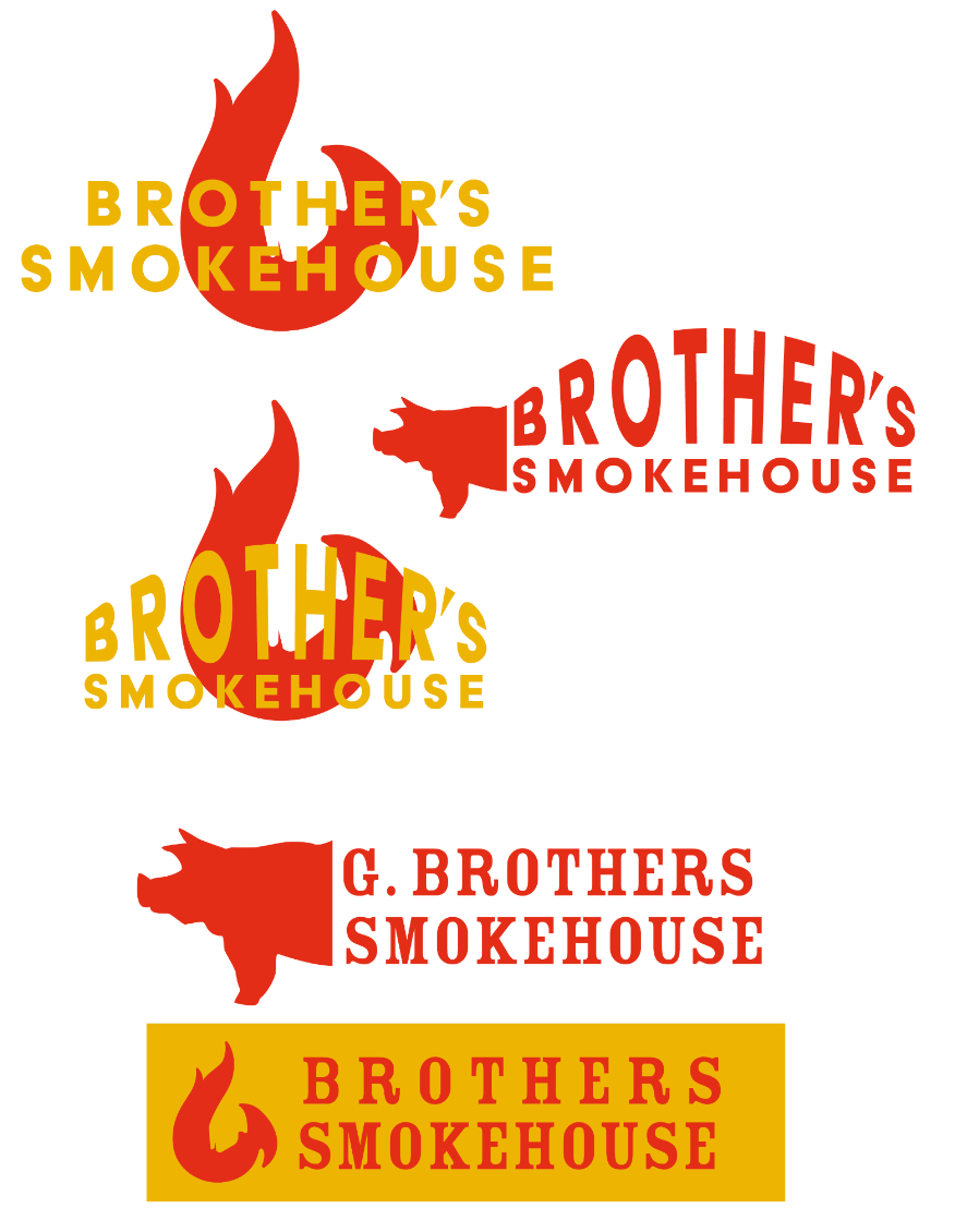
Logo Iterations
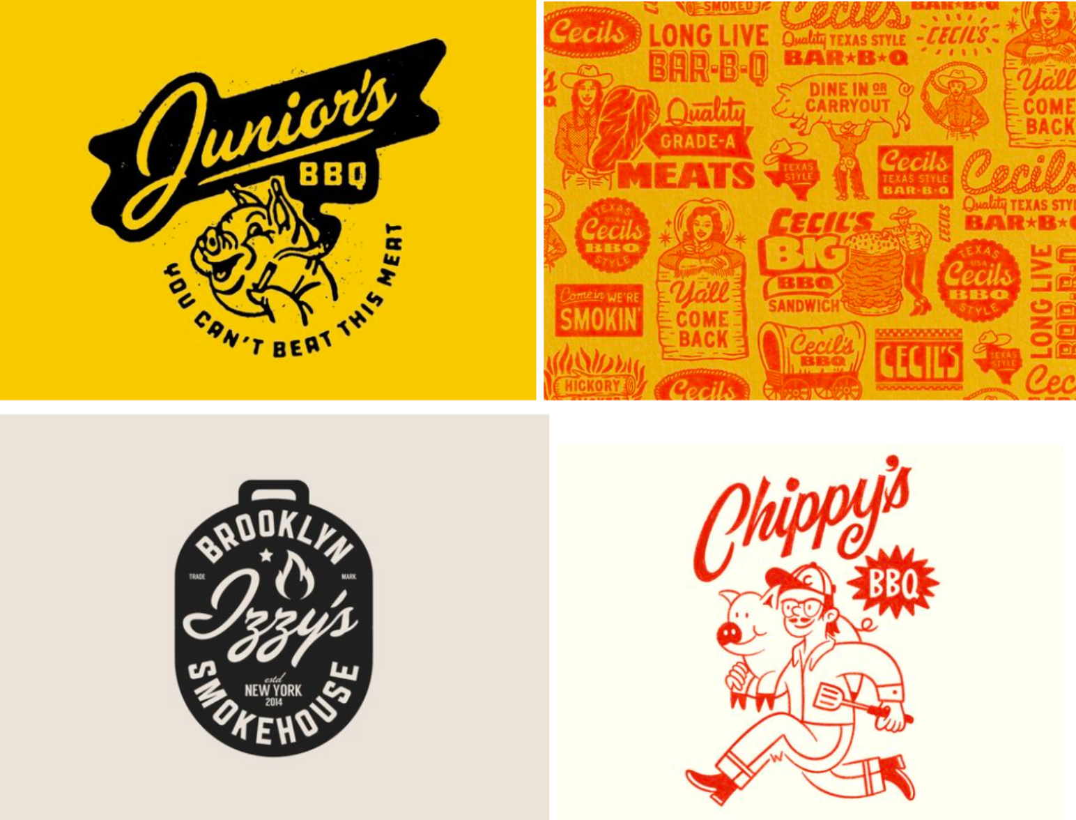
Moodboard
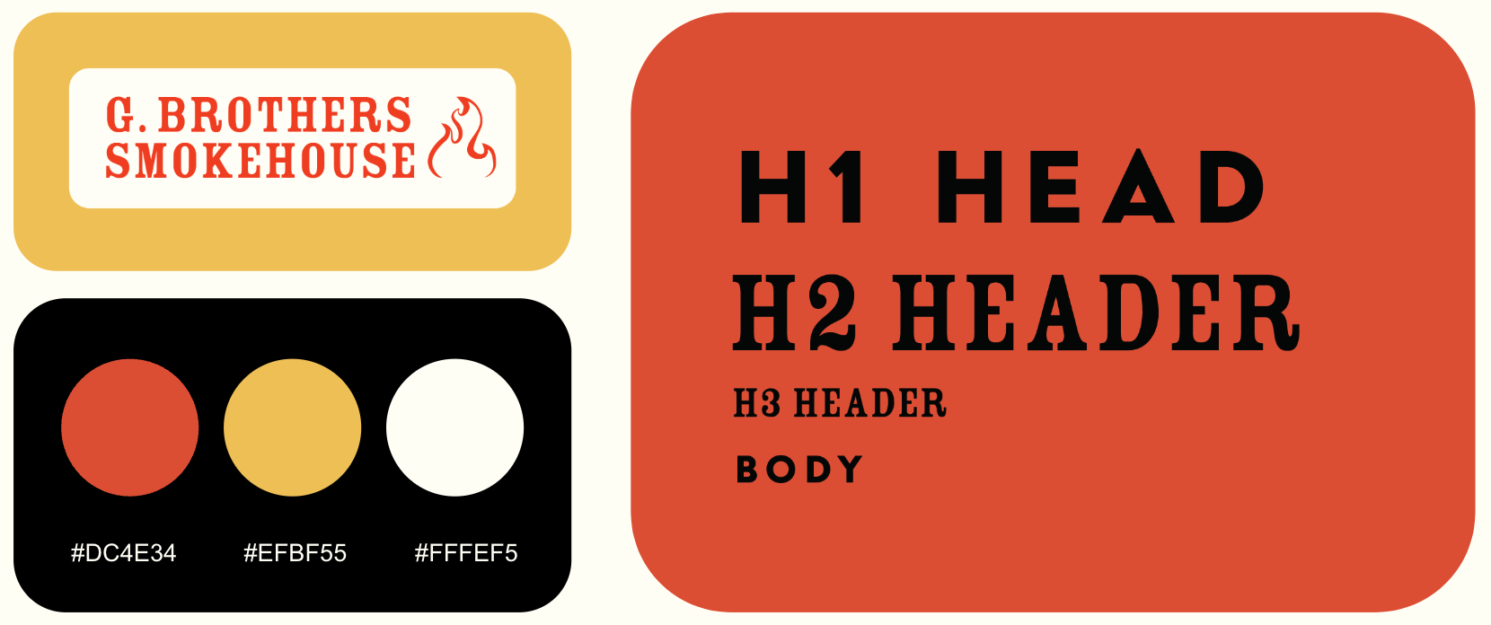
Style Guide
Final Designs


By focusing on functionality, visual appeal, and brand consistency, we successfully rebranded the restaurant's website, achieving much higher user satisfaction rates. The use of systematic analysis and user feedback allowed us to create a website that not only met but exceeded expectations.
Thanks for viewing :)